One other problem is the size of portion throughout time. There are some indications that portion size has increased over the years: people put more food on their plates than they used to. But how can you actually measure this as no one really weighs the amount of food they put on their plate on a daily basis? Well, some researchers in Ithaca
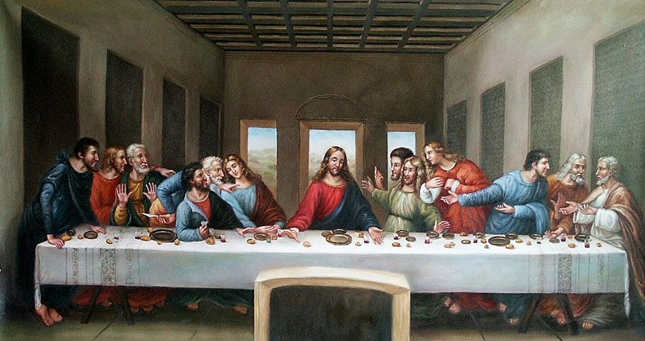
By looking at the 52 most famous depictions of The Last Supper, all produced over the last 1,000 years, researchers were able to compare portion sizes of a main meal, bread and plate size (as these all happen to be mentioned in the Bible). Over time, the size of a main meal increased with a staggering 69%, while plates became 66% larger. The size of a loaf of bread increased a modest amount with 23%. Several studies have already proven that, when offered more food, people will eat more, regardless of hunger and satiety. Moreover, the speed with which portions increased accelerated over time.
A subtlety that ought to be mentioned here is that this concerns ‘normal’ meals. It is well known that fast food portion have increased over time: take for instance your average McDonalds burger. Since its introduction, it has increased over 500% in size (in the USA of course, in Europe it’s ‘only’ about 300%). And that’s just burgers. As the whole portion size issue seems to be implicated in the surging obesity epidemic of the last few decades, this study seems of particular interest. Maybe we could compare what James Bond has been having for dinner next?
No comments:
Post a Comment